
Edit text, headings and buttons
Change the words on your pages, pick a heading size, style text with typefaces and colors, and set up buttons that link to your pages.
Headings, text and buttons are the blocks you use most on a page. You change their words and looks in the settings panel on the right of the editor. The page updates as you type.
Change the words
- Click the heading or text on your page to select it.
- In the settings panel, click General to open it if it is closed.
- Edit the words in the Text box.
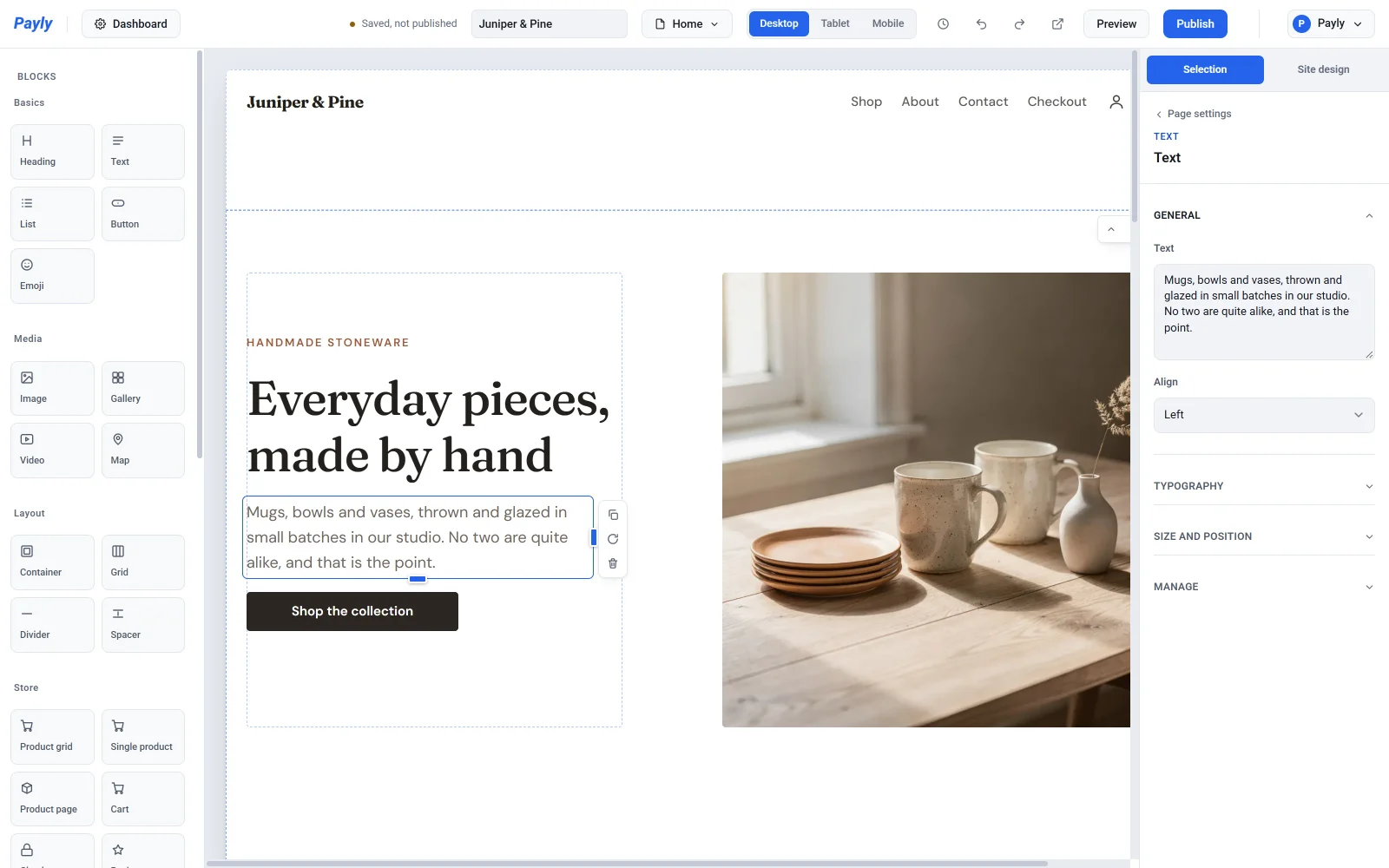
Your changes are saved automatically. Press Enter in the box to start a new line inside the same block. The block stays one paragraph, and the new line is a line break.
Note: A text block holds plain text. You cannot make a single word bold or turn part of a sentence into a link. To emphasize something, put it in its own block and change that block's Weight or Italic setting. To link, use a button block (see Buttons below).
Headings
A heading block has three settings under General:
- Text is the heading's words.
- Size picks the heading level, from Heading 1 to Heading 6. Level 1 is the largest. The level also tells search engines and screen readers how your page is organized, so use Heading 1 once for the page's main title, Heading 2 for its main parts, and the smaller levels below those.
- Align is Left, Center or Right.
A text block has Text and Align. Use it for paragraphs.
Style text and headings
Open Typography in the settings panel to change how the words look. Anything you leave on its default follows your site design, so your pages stay consistent.
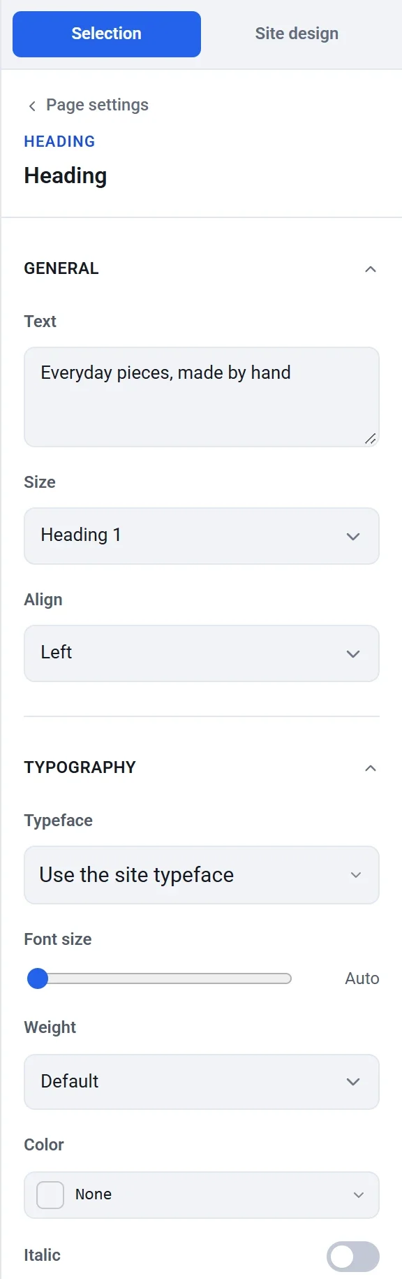
- Typeface: choose a font for this block, or leave Use the site typeface.
- Font size: slide to a size in pixels, or leave it on Auto to use the size for the heading level or the site's text size.
- Weight: from Regular to Black.
- Color: click the color box to choose a color from your theme colors, your recent colors or any hex code. Click None to go back to the site's color.
- Italic: turn italics on or off for the whole block.
- Letter case: As typed, UPPERCASE, lowercase or Capitalize Each Word.
- Letter spacing and Line height: open up or tighten the text.
Buttons
A button block is a link that looks like a button. Click a button on the page to select it, then work through its settings.
Label and link
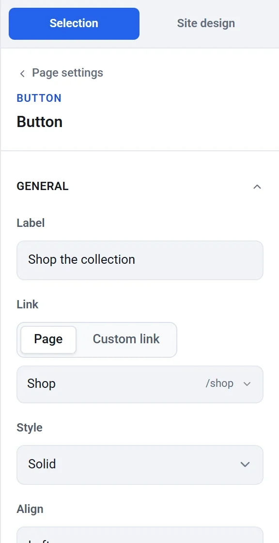
- Under General, type the button's words in Label.
- Under Link, choose where the button goes:
- Page lets you pick one of your own pages from a list. You can search the list by name. This is the best choice for pages in your store, because the link keeps working if you later change a page's address.
- Custom link lets you type any address, such as
https://example.com, an email link such asmailto:you@example.com, or a phone link such astel:+15555550100. Start the address withhttps://. An address without it, such aswww.example.com, does not work.
A new button has no link yet, so it goes nowhere until you choose one.
Style and position
Style is Solid, Outline or Subtle. Align places the button on the left, in the center or on the right of the space it occupies.

Appearance
Open Appearance to make a button your own.
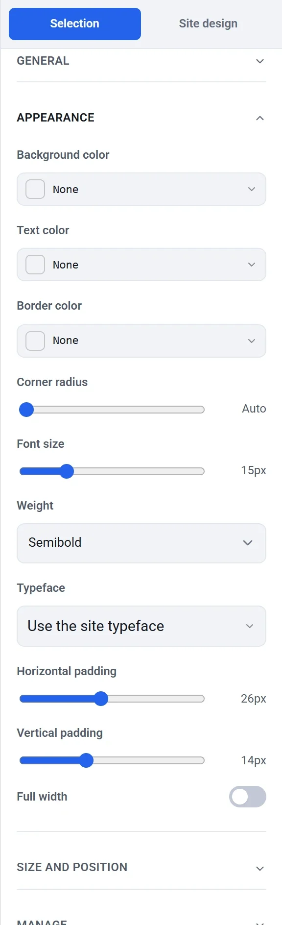
- Background color, Text color and Border color override the colors from your site design. Leave them on None to keep the site's accent color.
- Corner radius rounds the corners. Auto uses your site's corner radius.
- Font size, Weight and Typeface style the label.
- Horizontal padding and Vertical padding make the button larger or smaller.
- Full width stretches the button across the space it occupies.
Tip: To change the main color of every button at once, change Accent in your site design instead of styling each button. See Set your colors, fonts and layout.