
Make your site look right on phones and tablets
See how your store looks on tablets and phones, hide blocks on small screens, and adjust a block's position for one screen size only.
Most shoppers visit a store on a phone, so your pages have to work at every size. You design once, and Payly adapts the page for tablets and phones. This article explains what happens by itself and how to change it when you want a block to behave differently on a smaller screen.
How your layout adapts
Blocks sit in cells of a 12-column grid, never at fixed pixel positions, so they cannot overlap on a small screen. The page switches layout at two points:
- Tablets (screens narrower than 1024 pixels) keep the same grid. A block stays where it is unless you move it for tablets.
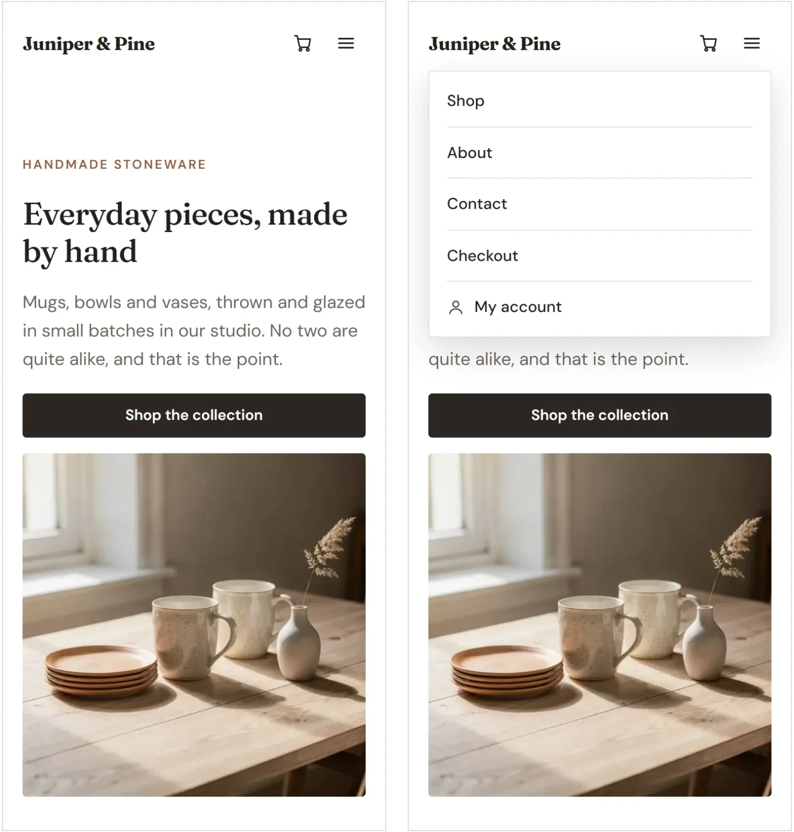
- Phones (760 pixels or narrower) put every block on its own row at full width. The blocks stack from top to bottom in the order you read them on the desktop: top to bottom, then left to right.
Some blocks adapt further. Header links fold behind a menu button, grids collapse to one column, and galleries and logo strips show two columns. The result is a store that works on a phone without any extra setup.
Switch between screen sizes
- In the top bar of the editor, click Tablet or Mobile. The page narrows to show how it looks at that size.

- Look through the page for anything that does not read well. Scroll, and select blocks as you normally do.
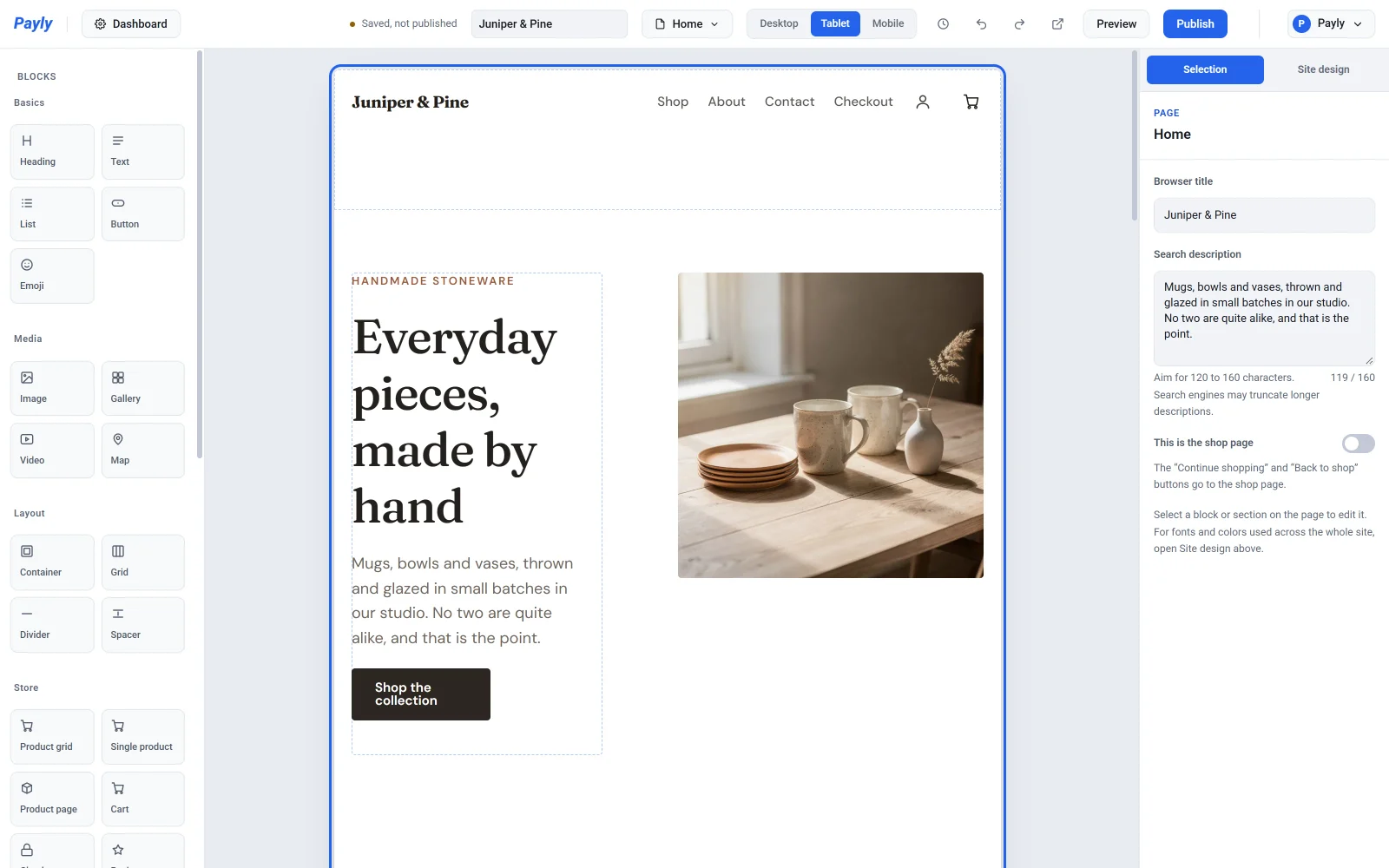
- Click Desktop to go back to the full-size layout.
These buttons do more than preview. They also choose which layout you are editing. When you switch to Tablet or Mobile, a message reminds you that changes apply to that size only. Anything you change there leaves the desktop layout alone.
Hide a block on small screens
A big photo or a long decorative block can crowd a phone. You can hide it on small screens and keep it on desktop.
- Click Mobile (or Tablet) in the top bar.
- Select the block.
- In the settings panel, open Size and position.
- Turn on Hide on mobile (or Hide on tablet). The block disappears from that view and leaves no empty gap on the live page.
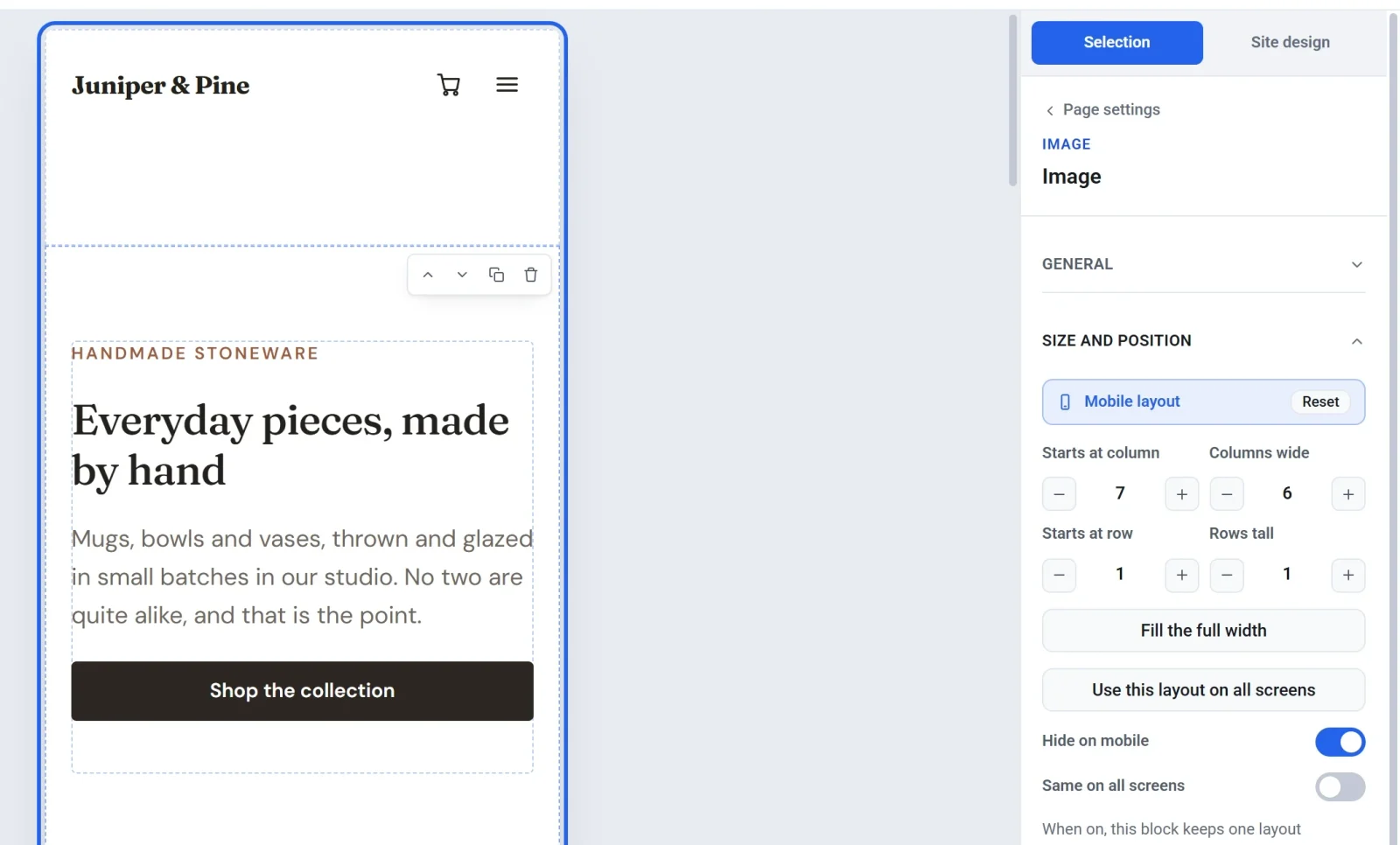
A block hidden on tablets is hidden on phones too, unless you turn the switch off again while viewing Mobile. To hide a block on every screen, use Hide this block on Desktop.
Place a block differently on one size
- Choose Tablet or Mobile in the top bar.
- Select the block and open Size and position.
- Change Starts at column, Columns wide, Starts at row or Rows tall, or click Fill the full width. You can also drag and resize the block on the page.
The bar at the top of Size and position says which layout you are editing. It shows Inherited while the block follows the larger size, and a Reset button once the block has settings of its own. Click Reset to make the block follow the larger size again. Click Use this layout on all screens to copy the current layout to every size.
The top bar also counts the blocks that differ from the desktop layout, for example 1 block differs on mobile. Click the count to jump from one such block to the next.
Keep a block the same on every screen
Turn on Same on all screens in Size and position to give a block one layout everywhere. Any settings it had for tablet or phone are removed, and later edits apply to every size at once.
Note: Moving a block into a different section changes it on every screen size, so Payly only allows that on Desktop. To place a block differently on phones, add it to both sections and hide the one you do not want on each size.
Check the result
Use Preview to click through your pages at phone and tablet widths, and view the published store on a real phone before you announce it. See Preview your site before publishing.