
Content blocks reference
A guide to every content block in the editor, from headings and images to testimonials, FAQs and forms, with what each is for and its main settings.
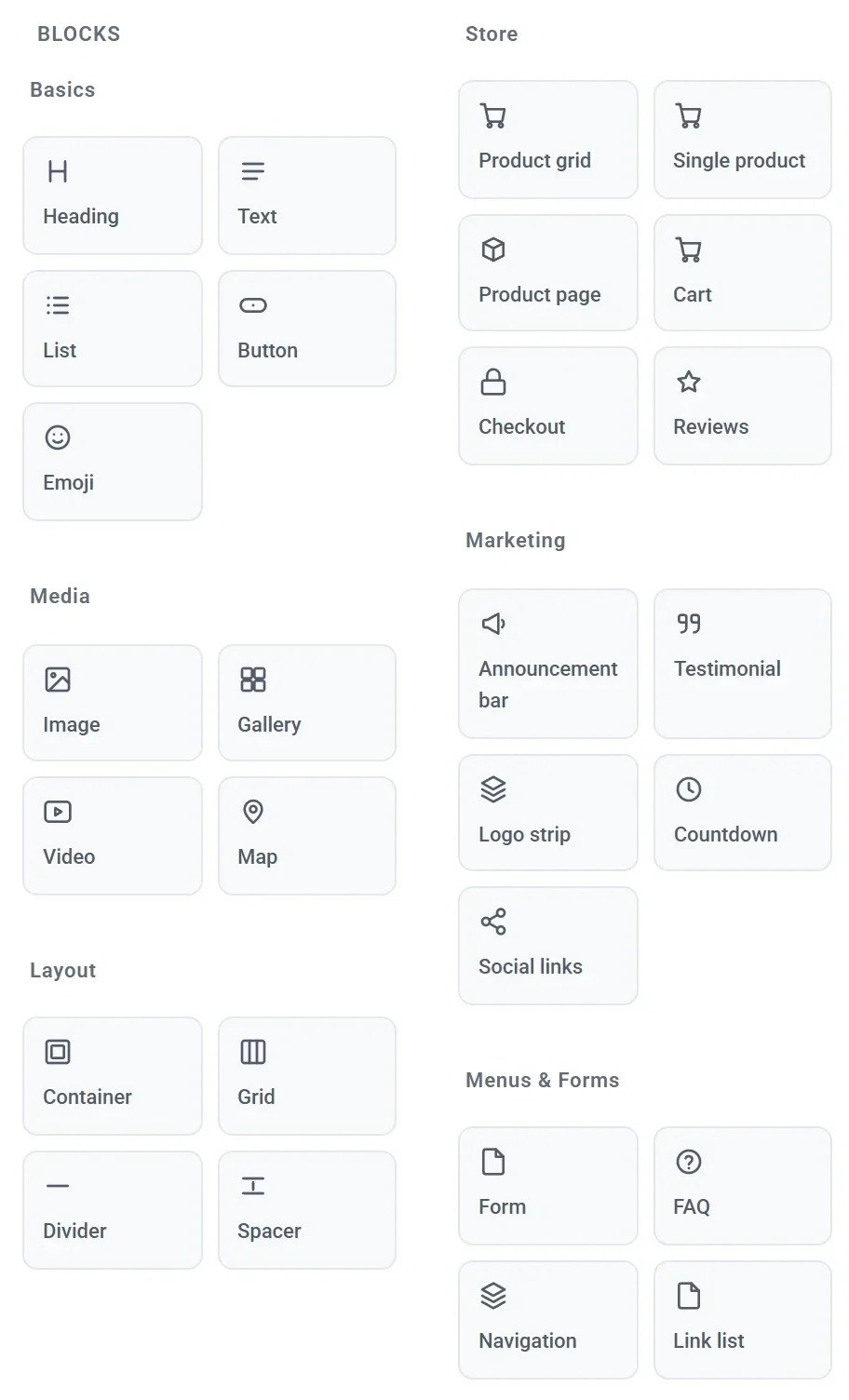
Every page of your store is built from blocks. This article lists the content blocks in the left panel of the editor, what each one is for, and its main settings. The blocks that show your products and handle the cart and checkout are in Store blocks.
Settings every block has
Click a block on the page to open its settings. Most blocks group them under General, Appearance and Typography. Every block also has Size and position, where you set its place in the grid and hide it on tablets or phones, and Manage, with Duplicate and Delete. See Add, move and resize blocks and Make your site look right on phones and tablets.
Where a block has Typography settings, they are the same each time: Typeface, Font size, Weight, Color, Italic, Letter case, Letter spacing and Line height. The tables below list them once as "Typography".
Basics
| Block | What it is for | Main settings |
|---|---|---|
| Heading | A title or section heading. | Text, Size (Heading 1 to Heading 6), Align, Typography. |
| Text | A paragraph of body text. | Text, Align, Typography. |
| List | A short list of points, such as what is included. | Items (one per line), Marker (Checkmark, Bullet, Dash, Numbered or None), Space between items, Typography. |
| Button | A button that goes to a page or an address. | Label, Link, Style (Solid, Outline or Subtle), Align, colors, Corner radius, text size, padding and Full width. |
| Emoji | One large emoji as a simple decoration. | Emoji (pick one or type your own), Font size, Align. |
For more on text and buttons, see Edit text, headings and buttons. A button's Link works like a menu link: see Edit your menu links.
Media
| Block | What it is for | Main settings |
|---|---|---|
| Image | A single photo or graphic. | Image, Alt text (a short description for people who cannot see the picture), Shape (Wide 16:9, Standard 4:3, Square or Original), Image fit (Fill the frame or Fit inside), Corner radius. |
| Gallery | A grid of pictures, which can open full size when clicked. | Pictures, Number of columns (1 to 6), Grid gap, Shape, Corner radius, Open full size when clicked. |
| Video | A video from YouTube, played on your page. | YouTube link. Payly never hosts video files. |
| Map | A Google map of your studio, shop or pickup point. | Address or place, Zoom, Shape, Corner radius. Type the address as you would search for it. |
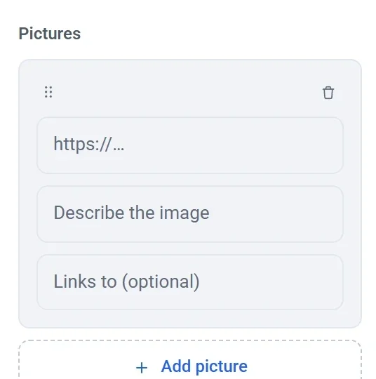
In a Gallery, each picture is added by its web address, with a description and an optional link. To use a photo you uploaded, copy its address from the Media screen. See Add images and use the media library.
Layout
| Block | What it is for | Main settings |
|---|---|---|
| Container | A box that holds other blocks, so you can style and move them as one piece. | Inside layout (Free grid, Stacked or Side by side), Grid gap, Align items, Background color, Border color, Corner radius, padding, Minimum height. |
| Grid | A table of rows and columns with a block in each cell. It becomes one column on a phone. | Number of columns and Number of rows (1 to 8 each), Grid gap, Align items, Cell outline, colors, padding. |
| Divider | A thin line between two parts of a page. | Color, Thickness. |
| Spacer | Empty space between blocks. | Height. |
See Build layouts with containers and grids.
Marketing
| Block | What it is for | Main settings |
|---|---|---|
| Announcement bar | A slim colored bar for a short message, such as a delivery offer, with an optional link. | Text, Link text, Link, Align, Background color, Text color, Font size. |
| Testimonial | A customer quote with a name, a short description, a photo and a star rating. | What they said, Name, Description, Photo, Stars (0 to 5), Align, colors, Typography. |
| Logo strip | A row of logos, such as shops that stock your work or press coverage. | Logos, Number of columns, Grid gap, Logo height, Mute colors until hovered. |
| Countdown | A timer that counts down to a date, for a sale or a launch. | Counts down to, Message when time is up, Show day and hour labels, Align, Digit size, colors. |
| Social links | Icons that link to your social media accounts. | Accounts (a network and an address for each), Style (Filled circle, Outlined circle or Icon only), Icon size, Grid gap, Align, Circle color, Icon color. |
To show an announcement bar on every page, drop it into your header. The countdown reads the date in each visitor's own time zone, so midnight means their midnight. Social links offer Instagram, Facebook, TikTok, X, YouTube, LinkedIn, Pinterest, WhatsApp, Email and Website.

Menus and forms
| Block | What it is for | Main settings |
|---|---|---|
| Form | A contact form whose messages are emailed to you. | Form title, Description, Fields, Submit button text, Message after submit, colors. |
| FAQ | Questions that open to show their answers. | Heading, Questions (a question and an answer each), Open the first answer, One answer open at a time, Background color, Typography. |
| Navigation | Your logo and menu. It is already in your header. | Site logo, Wordmark, Logo height, Layout, Show cart button, Links, colors. |
| Link list | A titled column of links, as used in a footer. | Column heading, Links, Background color, Typeface, Color, Font size. |
See Add a contact form, Edit your menu links and Customize your header and footer.