
Store blocks: product grid, product, cart and checkout
Show your products and take orders with the store blocks: product grid, single product, product page, cart, checkout and reviews, and what each setting does.
Store blocks show what you sell and let shoppers buy it. They are in the Store group of the left panel. Products themselves are managed in your site dashboard, not in the editor. The blocks only display them, so when you change a price or add a product, every block that shows it updates.
The store blocks at a glance
| Block | What it shows |
|---|---|
| Product grid | Several products in a grid, such as your shop page or a bestsellers row. |
| Single product | One product as a card, to feature it anywhere. |
| Product page | The full page of one product: photos, price, description and the Add to cart button. |
| Cart | What the shopper has chosen, with a total and a Checkout button. |
| Checkout | The form where the shopper enters their details and pays. |
| Reviews | The ratings and reviews for one product. |
Your site already has a Cart page and a Checkout page, each with its block in place, and one shared layout for product pages. You rarely need to add the cart, checkout or product page block yourself.
Product grid
Drag a Product grid onto a page, then click it to open its settings.
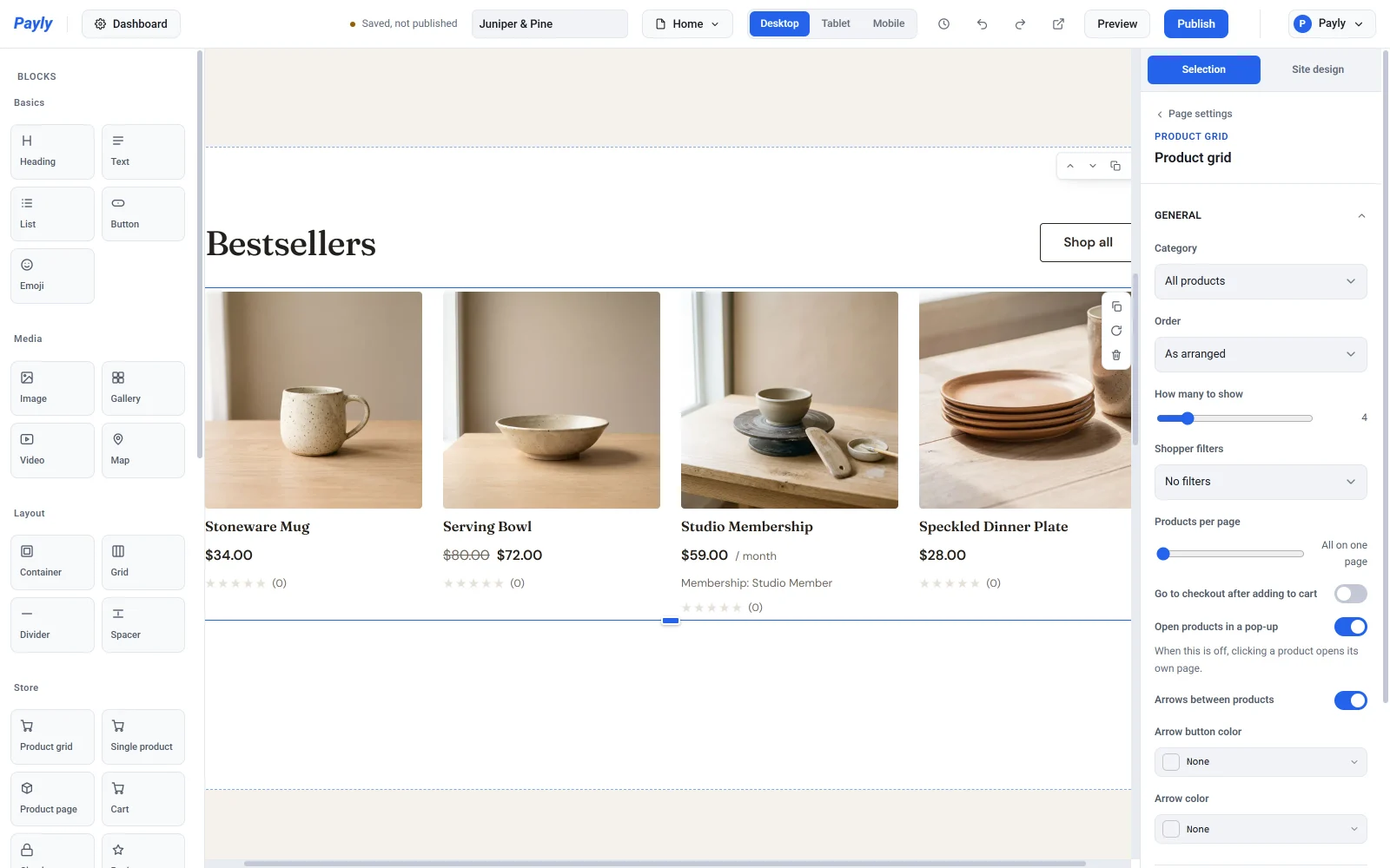
Under General:
- Category limits the grid to one category, or shows All products.
- Order sorts the products: As arranged, Newest first, Name A-Z, Price, low to high or Price, high to low.
- How many to show caps the number of products. At All, every product appears.
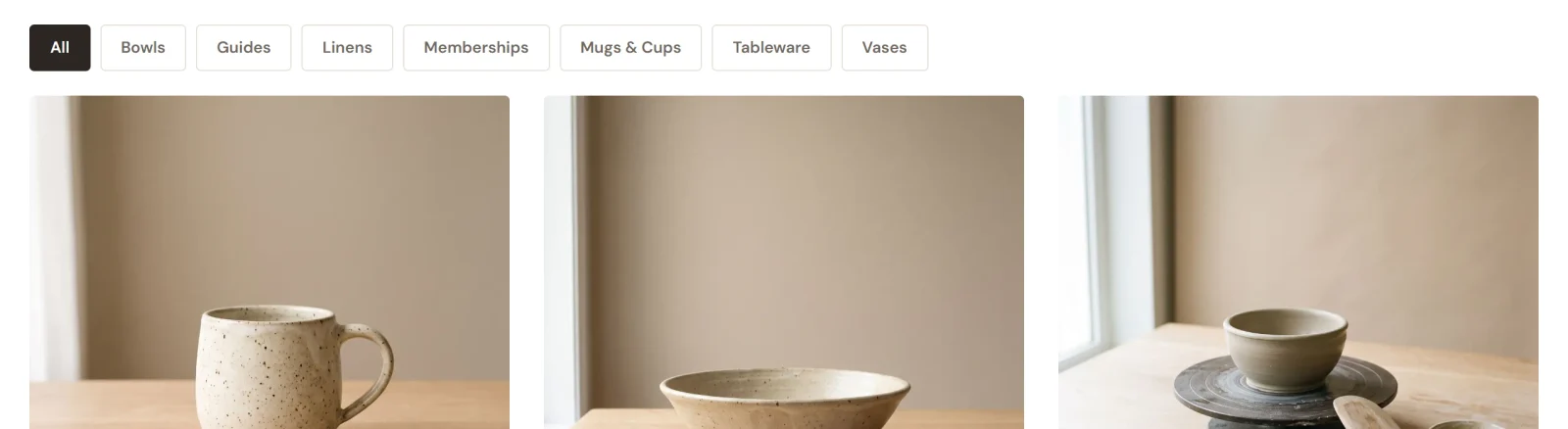
- Shopper filters adds buttons so shoppers can narrow the grid By category, By tag or By category and tag.
- Products per page splits a long grid into pages. At All on one page, there is no paging.
- Go to checkout after adding to cart sends shoppers straight to checkout when they add something. Leave it off if most shoppers buy more than one item.
- Open products in a pop-up shows a product in a pop-up so shoppers keep their place in the grid. When it is off, clicking a product opens its own page. Arrows between products and the two arrow colors apply to that pop-up.
Under Appearance, set the Number of columns, the Grid gap and the picture Shape. Switch Show price, Show category and Show add to cart on or off, change the Button text, and set the Card background and Card text color.
To organize products, see Organize products with categories and tags. To make one page your shop, see Set up your shop page.
Single product
Use Single product to put one item on any page, such as your home page. Pick it under Product. You can change the picture Shape, show or hide the price and the add to cart button, change the Button text, and set the card colors.
Product page
You design the page every product shares once. In the page list at the top of the editor, choose Product template. It shows your first product as a stand-in, but whatever you change applies to all of them.
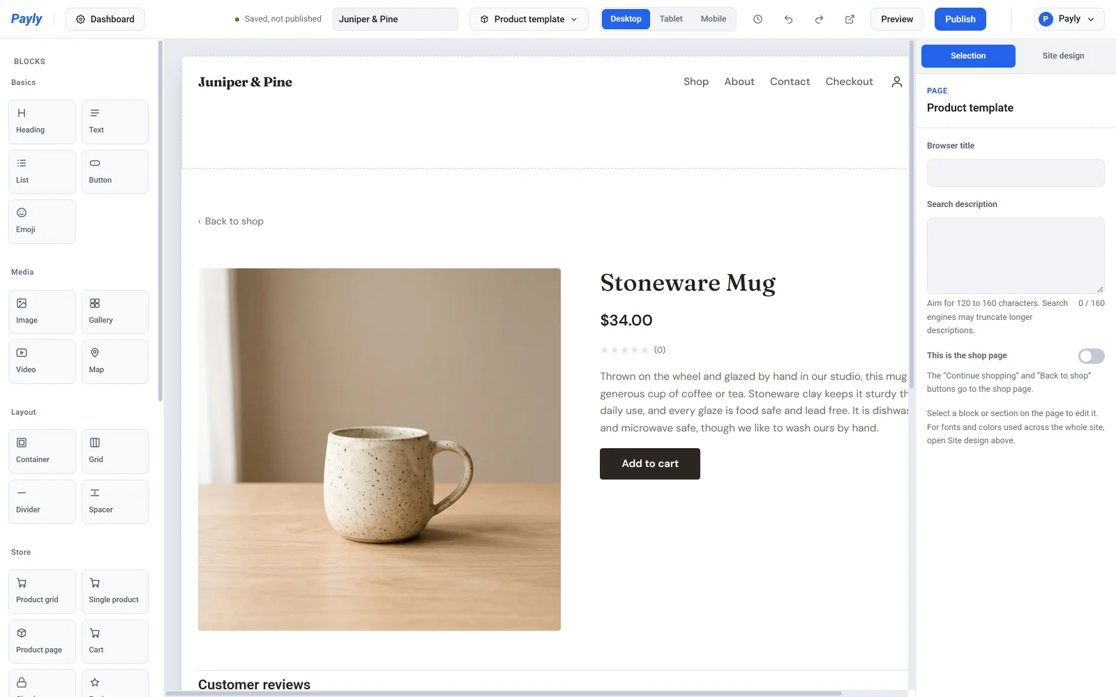
Click the Product page block to switch parts on or off: Photo gallery, Description, SKU and Reviews. You can change the Button text too. Under Back link, choose where the link above the product goes and what it says. By default it goes to your shop page. For more detail, see How product pages work.
Cart
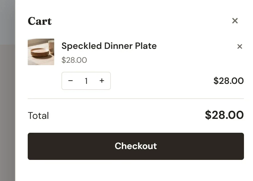
The Cart block sits on your Cart page. Its settings are the Heading, the Empty message, Show total and the Checkout button text, plus the background and text colors. A shopper's cart is kept in their own browser until they check out.
The cart icon in your header opens a cart panel on the same page, so shoppers rarely need to leave what they are looking at.
Checkout
The Checkout block is your Checkout page. It shows the shopper's details on the left and their order, any discount code and the pay buttons on the right.
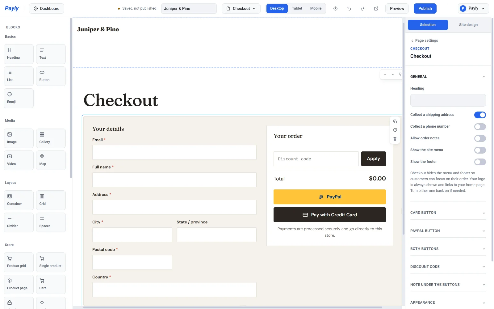
Under General:
- Heading is the title above the form.
- Collect a shipping address adds the address, city, state, postal code and country fields. Shipping zones and location-based tax use the address to work out the rate, so leave it on if you set those up.
- Collect a phone number and Allow order notes add those optional fields.
- Show the site menu and Show the footer are off by default, so shoppers see only your logo and stay focused on paying. Turn either on to bring it back.
The other groups style the page:
- Card button changes the text, colors and icon of the credit card button.
- PayPal button offers PayPal's own wording and colors. PayPal allows nothing else on a button that carries its name.
- Both buttons sets the corner radius, size, layout (Stacked or Side by side) and which button comes first.
- Discount code sets the size of the code box. The box shows only while you have a code shoppers can use.
- Note under the buttons turns on or off a line of reassurance, lets you write your own, and sets its alignment.
The pay buttons appear when Stripe or PayPal is connected. See How checkout works.
Reviews
The Reviews block shows the ratings and written reviews for one product. Choose it under Product, give it a Heading, and switch Show the rating summary and Let customers write reviews on or off. Reviews load when someone visits the page, so new ones appear without publishing again. Only signed-in customers can write one. Product pages already include reviews, so use this block when you want them somewhere else. See Collect and moderate product reviews.